Your LinkedIn branding is making first impressions. Here's the scientific way to get color and style right for maximum credibility.
Introduction
Your profile image, banner color, and post visuals speak before your words ever do.
On LinkedIn — a platform built on professional credibility — color isn't decoration. It's persuasion.
Yet, most professionals and companies still treat branding on LinkedIn as an afterthought. Their visuals don't align, their posts look inconsistent, and their colors don't reflect their authority. The result? Missed leads, lost trust, and lower engagement.
This article dives into the science behind LinkedIn branding strategy — exploring the psychology of color, the power of visual consistency, and the ongoing debate between personal branding vs corporate branding.
You'll also see how SparkFolio's AI now generates LinkedIn-optimized brand palettes automatically — designed to boost both visibility and credibility.
Why LinkedIn Branding Matters More Than Ever
LinkedIn has evolved from a resume platform into the B2B powerhouse of digital marketing. Over 65 million decision-makers use it daily, and content shared here converts 277% better than Facebook or Twitter for B2B audiences.
But those conversions don't start with content — they start with visuals.
A study from the University of Loyola found that color increases brand recognition by up to 80%. Meanwhile, LinkedIn's algorithm prioritizes consistency — profiles that maintain a unified color and style across banners, posts, and visuals gain higher engagement and recognition over time.
Your brand palette doesn't just decorate your posts — it programs familiarity.
On a platform where trust drives deals, color psychology is your silent sales tool.
The Science of Color on LinkedIn
LinkedIn is a platform built around trust, competence, and authority. And the colors that dominate successful profiles reflect that psychology.
The "LinkedIn Blue Effect"
LinkedIn's interface itself sets a tone: calm, reliable, and professional. Its blue color palette subconsciously communicates stability and intelligence — qualities associated with leadership and reliability.
When your visuals complement this tone — through blues, grays, whites, or muted secondary colors — your brand appears naturally aligned with the platform's psychology.
Warm vs Cool Palettes
- Cool tones (blue, gray, navy) → evoke trust and professionalism
- Warm tones (orange, red, gold) → create energy and attention
- Neutral tones (white, beige, black) → provide balance and sophistication
The key isn't picking one — it's blending them with intent. Too much warmth feels aggressive; too much coolness feels distant. The best-performing profiles on LinkedIn balance both — professional base colors with subtle accents that humanize the tone.
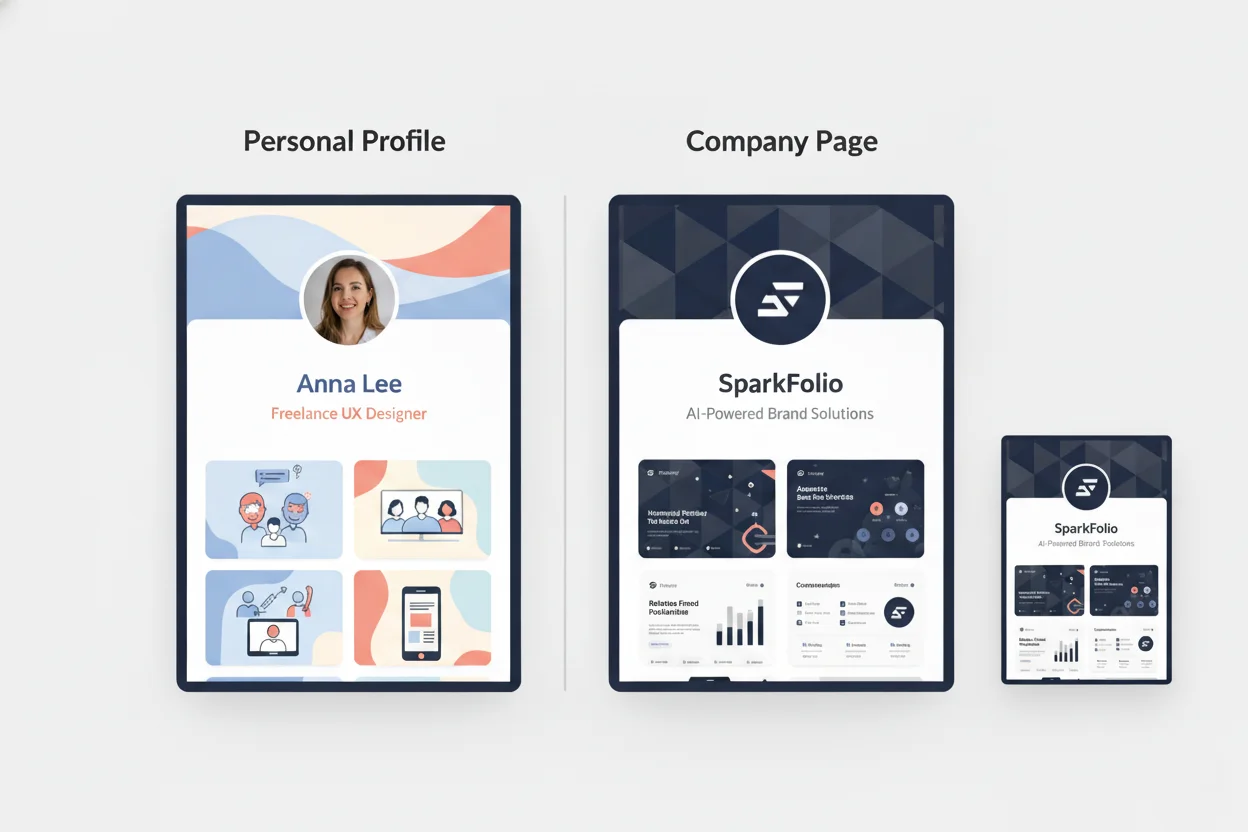
Personal Branding vs Company Branding: The Core Difference
The debate between personal brand and company brand is not new — but on LinkedIn, the rules shift.
Your personal profile and your company page serve different psychological purposes:
| Aspect | Personal Brand | Company Brand |
|---|---|---|
| Emotional Connection | Relatable, human, story-driven | Professional, trustworthy, authoritative |
| Voice | Conversational and authentic | Strategic and informative |
| Color Psychology | Warm, expressive tones | Stable, neutral or cool tones |
| Goal | Build authority and trust | Build credibility and attract clients |
| Lead Source | Personal engagement and storytelling | Corporate credibility and case studies |
Both matter. But choosing the right color palette can amplify each one differently.
The Psychology of Personal Branding Colors on LinkedIn
Personal brands on LinkedIn thrive on warmth, authenticity, and visibility.
That means using colors that evoke approachability without losing professionalism.
Best Color Strategies for Personal Brands
Soft Blues & Teals: Communicate calm authority and openness. Perfect for consultants, coaches, or creators.
Warm Accents (Coral, Gold, or Terracotta): Add approachability and friendliness without being unprofessional.
Neutral Backgrounds (White, Gray): Keep posts readable and clean for mobile and desktop.
Consistency Across Profile:
- Profile banner
- Post visuals
- Document thumbnails
- Video overlays
When your color palette stays consistent, followers begin to recognize you instantly.
Case Study: The Solopreneur Consultant
A leadership coach used soft blue and coral as her LinkedIn color palette. Within 60 days, her posts saw 1.8x more engagement, and profile visits doubled. Her visuals didn't just look good — they felt human.
Color made her credibility visible.
The Psychology of Company Branding Colors on LinkedIn
Company brands on LinkedIn win through stability and confidence.
Corporate audiences respond better to structured, clean, and high-contrast visuals. The right palette reinforces authority and professionalism — without sacrificing approachability.
Best Color Strategies for Company Brands
-
Dominant Cool Colors (Navy, Deep Blue, Steel Gray): Build trust and reliability — perfect for B2B SaaS, finance, or tech.
-
Accent Colors (Green for growth, Orange for innovation): Provide energy and memorability.
-
Readable Contrast: Ensure text overlays meet WCAG contrast standards — especially important for posts with infographics.
-
Static Brand Grid: Your banners, carousels, and thought leadership posts should all look like one family.
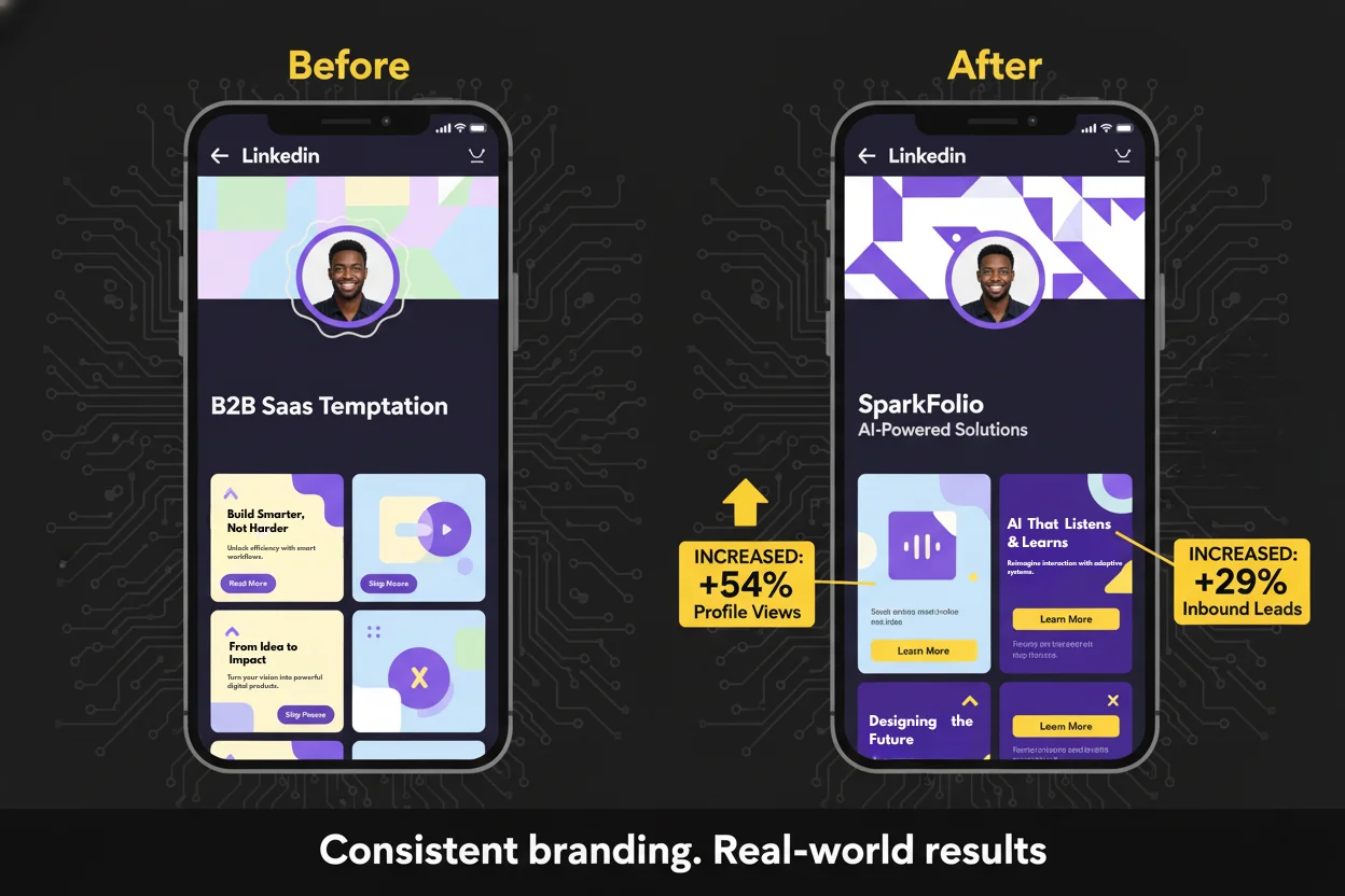
Case Study: The B2B SaaS Company
A SaaS firm replaced their inconsistent visuals with a LinkedIn-specific palette: navy blue primary, light gray secondary, and green CTA highlights. Their profile views increased 54%, and inbound leads rose by 29% over a quarter.
The design didn't change their message — it amplified it.
Visual Consistency and the LinkedIn Algorithm
LinkedIn's algorithm rewards predictability in branding.
When your visuals consistently use the same hues, font styles, and layout structures, your audience's recognition increases — and so does your visibility.
Here's why:
- Repeated exposure builds memory. Users begin recognizing your content instantly, even without seeing your name.
- Algorithmic boost. LinkedIn's system prioritizes engagement velocity. When your visuals are instantly recognizable, more followers engage early — signaling relevance to the algorithm.
- Human psychology. Consistency triggers trust. Familiar patterns feel reliable; erratic visuals feel risky.
Statistic to Remember
A Venngage study found that consistent brand visuals increase engagement by up to 400% on LinkedIn.
The takeaway: visual repetition isn't boring — it's branding.
When to Lead with Personal Branding
You should emphasize personal branding if:
- You're a consultant, coach, freelancer, or solopreneur.
- Your business is built on trust in you rather than a company entity.
- You want to build thought leadership and emotional connection.
LinkedIn Personal Branding Tips
-
Show Face + Color Together: Use headshots that align with your brand palette. Background banners should complement your profile photo colors.
-
Humanize with Texture: Add gradients, soft lighting, and real imagery. Avoid overly corporate templates.
-
Post Design Consistency: Use 2–3 dominant colors across every carousel, post, and thumbnail.
-
Leverage Emotion: Colors that evoke warmth and honesty outperform neutral, robotic visuals.
Personal brands are stories told in pixels. Make sure yours tells the right one.
When to Lead with Company Branding
You should emphasize company branding if:
- You're targeting enterprise or B2B clients.
- You need structured brand credibility (not individual personality).
- You operate with multiple team members posting under one brand voice.
LinkedIn Company Branding Tips
-
Anchor Color: Choose a single dominant hue (e.g., navy or charcoal) as your visual signature.
-
Accent Consistency: Use one accent (e.g., green for innovation, yellow for optimism) across ads and posts.
-
Typography Matters: Stick to clean sans-serif fonts like Inter, Lato, or Roboto for a tech-professional feel.
-
Template System: Create standardized LinkedIn post layouts — every piece should feel like it belongs to one ecosystem.
Company branding builds recognition through professionalism and predictability.
When done right, it transforms your content feed into a visual sales funnel.
Color Psychology Meets Lead Generation
It might sound abstract — but color directly impacts conversion and lead quality on LinkedIn.
The Emotional Equation
| Color | Emotion | Ideal Use on LinkedIn |
|---|---|---|
| Blue | Trust, logic, authority | Primary palette for B2B and tech firms |
| Green | Growth, balance, renewal | Perfect for sustainability, finance, or SaaS |
| Red | Energy, urgency | Good for CTA highlights or campaigns |
| Yellow | Optimism, warmth | Great accent for personal brands |
| Gray/White | Neutrality, balance | Foundational tone for readability |
| Black | Power, sophistication | Ideal for premium or enterprise positioning |
Your color palette defines how your audience feels when they see your content — and emotion drives memory, which drives leads.
How SparkFolio Generates LinkedIn-Optimized Brand Palettes
AI is now doing what human designers take weeks to accomplish — creating platform-specific, psychologically tuned brand identities in minutes.
Here's how SparkFolio's AI helps you dominate LinkedIn visually:
1. Platform Intelligence
SparkFolio recognizes LinkedIn's unique color environment — muted blues, whites, and grays — and optimizes your palette for maximum contrast and visibility.
2. Personal vs Corporate Tone Matching
It detects whether your goal is personal authority or corporate trust and adjusts color temperature, saturation, and layout logic accordingly.
3. Algorithmic Color Testing
Each palette is stress-tested for engagement probability based on behavioral color data from thousands of high-performing LinkedIn posts.
4. WCAG and Accessibility Compliance
Every generated palette automatically meets WCAG AA/AAA contrast standards — ensuring clarity, inclusivity, and professional polish.
5. Cross-Profile Consistency Generator
SparkFolio creates a matching visual set for:
- Banner images
- Carousel templates
- Profile backgrounds
- LinkedIn Ads visuals
So your brand looks cohesive across every touchpoint — personal or company.
In short: SparkFolio doesn't just make your brand "look good" — it makes it convert better on LinkedIn.
Case Study: Personal vs Company Branding in Practice
Case 1: The LinkedIn Creator
A marketing strategist built her personal brand using warm coral and navy tones with consistent banner design. Within 90 days:
- Follower count: +300%
- Profile views: +220%
- Inbound client messages: +45%
She later used SparkFolio to expand her palette into a mini-style system for posts — her engagement consistency stabilized long-term.
Case 2: The B2B SaaS Startup
The company's team was using random Canva visuals. SparkFolio generated a LinkedIn-optimized palette (navy primary, teal accent, white base). Their ad engagement rate jumped 41%, and lead generation cost dropped 26%.
Color didn't just attract — it converted.
Building LinkedIn Brand Consistency That Converts
Whether personal or corporate, your visual consistency should follow these golden rules:
-
Limit to 3–4 Colors Avoid visual chaos. Simplicity is power.
-
Use the Same Filters and Tones Across Photos LinkedIn users subconsciously detect mismatch in lighting and tone — it signals inconsistency.
-
Stay Within Platform Psychology Use calm, trustworthy hues. Neon or saturated tones feel out of place on LinkedIn.
-
Repeat Design Motifs Same frame style, same accent color, same CTA button design. Repetition builds recognition.
-
Use AI for Optimization Tools like SparkFolio continuously analyze engagement metrics to refine your visuals for maximum lead performance.
The Future of LinkedIn Branding
As LinkedIn becomes more visual, the gap between average and elite branding will widen.
Soon, AI systems will generate real-time adaptive palettes — shifting color tones based on audience type or industry segment. For example:
- Warmer hues for personal posts,
- Cooler tones for company announcements,
- Neutral palettes for thought leadership articles.
SparkFolio is pioneering that shift — merging design psychology and platform data to create brands that evolve with engagement.
Tomorrow's winning brands won't just post consistently. They'll feel consistent.
Closing Thoughts
Your LinkedIn color palette isn't a design decision. It's a trust strategy.
In a world where first impressions form in seconds, visuals define whether people scroll past — or stop, read, and connect.
If your personal brand radiates warmth and your company brand projects confidence, you've mastered both sides of the equation.
But you don't need to guess. You can let AI make those decisions — intelligently.
Because on LinkedIn, credibility isn't built through logos or slogans. It's built through color, consistency, and confidence.
And SparkFolio makes all three effortless.