Discover the 7 color psychology mistakes destroying your startup's credibility—and how to fix them with data-backed color science.
Introduction
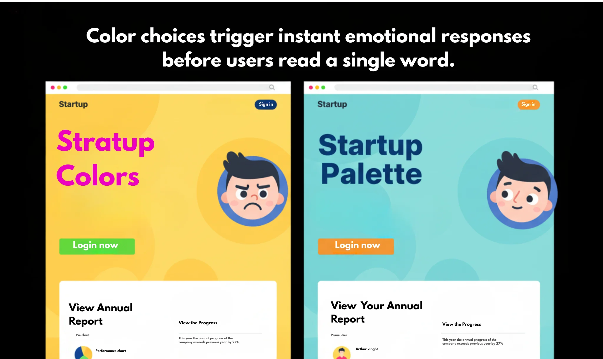
Have you ever visited a startup's website and instantly felt something was off—even before reading a single word? That unease wasn't random. It was color.
For startups, color psychology for startups is not just about making things pretty; it's about conversion optimization and trust. Yet, most early-stage founders overlook how deeply color influences user behavior. Studies show that up to 90% of snap judgments about products are based on color alone.
In this guide, we'll uncover the 7 deadly brand color mistakes that silently sabotage your credibility and sales—and how tools like SparkFolio's AI use data-driven color psychology marketing to avoid them.
What Is Color Psychology for Startups (and Why It Matters)
Color psychology is the science of how color affects human emotion and decision-making. In business, it's the invisible language your brand speaks before a visitor reads your headline or touches your product.
When someone lands on your website, color triggers instant, unconscious associations:
- Blue signals trust (used by PayPal, LinkedIn, and IBM).
- Red activates urgency and passion (think YouTube or Netflix).
- Green evokes growth and safety (like Spotify or WhatsApp).
For startups, these signals define whether a visitor feels your brand is credible—or chaotic. A mismatch between your color palette and your business values can cause instant doubt, higher bounce rates, and ultimately, lower conversions.
Color psychology marketing, when used strategically, can lift brand recognition by up to 80% and improve click-through rates across digital campaigns. Yet most founders treat it as decoration, not data.
The 7 Color Psychology Mistakes Startups Make
1. Using Favorite Colors Instead of Strategic Colors
Your favorite color might look great on your sneakers—but not necessarily on your website. One of the biggest startup branding errors is founders designing around personal taste rather than user perception.
Example: A fintech startup founder loved orange, using it across the brand. But orange, when overused in finance, can suggest impulsiveness instead of trust. Users subconsciously hesitated to connect their bank accounts.
Fix: Start with your audience, not yourself. Use demographic data and industry norms. For example:
- Tech and SaaS → blue or teal for reliability
- Health and wellness → green or soft neutrals for safety
- Retail and fashion → black and gold for sophistication
Color psychology for startups means designing for emotion, not ego.
2. Ignoring Cultural Context
Colors don't mean the same thing everywhere. Red may signal passion in the U.S., but it symbolizes luck in China and mourning in South Africa.
Global startups often overlook these cultural nuances, leading to brand disconnects in international markets.
Example: A European e-commerce platform launched in Japan using heavy white branding—unaware that white can be associated with mourning there. Their early campaign flopped.
Fix: Research color meanings across your target regions. SparkFolio's AI automatically adjusts palette suggestions based on geolocation, ensuring your colors align with local psychology, not clash with it.
3. Choosing Too Many Colors
Minimalism wins. Using more than three core brand colors confuses users and dilutes your identity. Visual clutter increases cognitive load and decreases comprehension—slowing decision-making by up to 30% according to UX research from the Nielsen Norman Group.
Example: A productivity app used six vibrant colors in its dashboard. Users felt overwhelmed, describing the interface as "distracting." Retention dropped 22% within weeks.
Fix: Adopt the 60-30-10 rule:
- 60% primary color (brand personality)
- 30% secondary (supporting tone)
- 10% accent (calls-to-action)
SparkFolio's AI suggests palette ratios that optimize for clarity and emotional coherence, ensuring harmony without monotony.
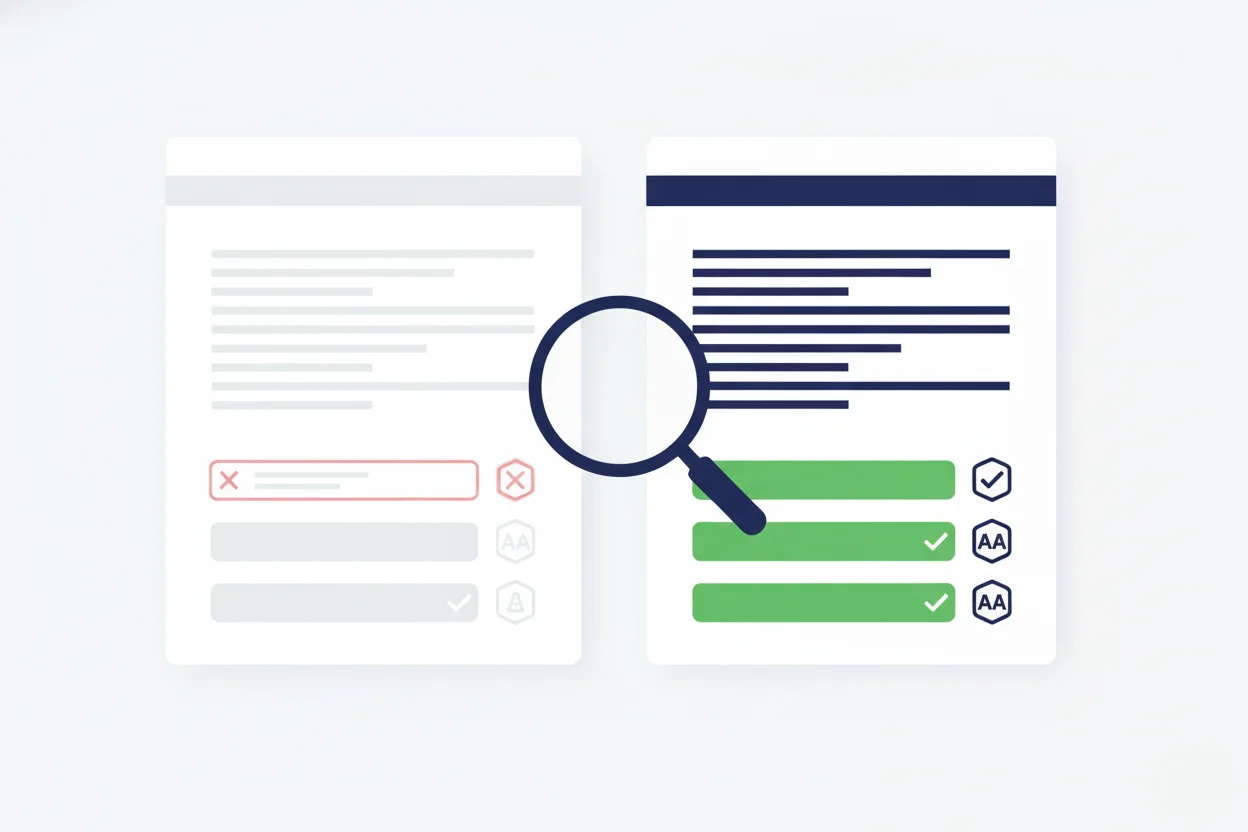
4. Neglecting Contrast and Accessibility
Colors don't just influence mood—they determine usability. Low contrast between background and text can ruin accessibility, alienating up to 15% of users with visual impairments.
Example: A startup used pastel gray text on a white background for an "elegant" aesthetic. Result: complaints, lower time on site, and declining conversions.
Fix: Use contrast ratios of at least 4.5:1 for body text and 3:1 for larger text. Tools like SparkFolio automatically test your palette for contrast compliance and suggest accessible alternatives—so your brand looks good and works for everyone.
5. Failing to Align Color with Brand Personality
Every color tells a story. When your palette doesn't match your message, you create emotional dissonance.
Example: A cybersecurity startup used bright pink and lavender to stand out. The issue? Those colors conveyed playfulness, not protection. Their credibility dropped in investor pitches.
Fix: Define your brand personality traits first (e.g., trustworthy, innovative, bold) and map them to corresponding color families.
- Trustworthy → blue, gray, white
- Innovative → electric blue, orange accents
- Bold → black, red, deep purple
SparkFolio maps brand archetypes to color palettes backed by psychological data, ensuring your visual identity matches your mission.
6. Copying Competitors' Colors
Imitation might feel safe—but it kills distinctiveness. Startups often mirror the dominant players in their niche, hoping to "fit in." Instead, they become invisible.
Example: A SaaS startup used the same blue-and-white scheme as Salesforce. In A/B tests, users confused the brand's ads with Salesforce's, resulting in a 42% lower click-through rate.
Fix: Analyze competitor color saturation and pick a unique contrast angle. SparkFolio's AI scans industry palettes and suggests underused, high-impact hues that maintain psychological consistency while differentiating your brand.
7. Ignoring Emotional Triggers in Conversion Points
The "Buy Now" button is your silent salesman. Yet many startups use bland or mismatched colors for their CTAs, missing out on easy conversion lifts.
Example: An e-learning startup tested gray versus green CTA buttons. Green boosted sign-ups by 37%. Why? It subconsciously signals "go" and growth.
Fix: Use color psychology for conversion optimization:
- Red → urgency and excitement (great for limited-time offers)
- Orange → friendliness and energy (great for sign-ups)
- Green → progress (great for checkout buttons)
- Blue → calm and trust (great for financial actions)
SparkFolio dynamically tests color variations with predictive analytics, adjusting CTAs for maximum response.
The Science Behind Color and Conversion
Color is more than aesthetics—it's neuromarketing in action. Research from the University of Winnipeg found that 62–90% of first impressions are driven by color alone.
Colors directly influence:
- Perceived credibility (blue tones increase trust)
- Conversion likelihood (contrasting CTAs increase clicks)
- Emotional engagement (warm colors drive energy; cool colors calm users)
Moreover, consistent use of brand color can increase recognition by up to 80%, according to the Journal of Business Research. This consistency makes users subconsciously associate your palette with reliability.
Startups that don't systematize color choice early end up rebranding within their first 18 months—costing thousands in design changes and lost equity.
Real-World Examples: Color Wins and Fails
Color Fail: The Airbnb "Bélo" Backlash
When Airbnb rebranded with its salmon-pink "Bélo" logo, users initially ridiculed the palette as "too feminine" and "off-brand." The confusion wasn't about design—it was psychology. Airbnb's previous blue suggested trust and travel reliability; the pink felt intimate, clashing with the brand's global neutrality.
Lesson: Don't change your emotional tone unless your mission evolves.
Color Win: Spotify's Neon Green
Spotify's lime green stands out in a sea of tech blues. It represents vibrancy, energy, and youth—exactly what the music experience delivers. Despite being unconventional, the color aligns with the brand's promise of personalization and movement.
Lesson: Own your emotion. Consistency creates recognition.
Color Fail: Juicero's "Sterile" White Branding
The now-defunct Juicero used stark white and silver branding, aiming for a "premium tech" look. Instead, it felt cold and clinical—detaching from the brand's health-centric mission. Consumers perceived it as impersonal, and the color palette reinforced its disconnect from natural authenticity.
Lesson: Colors must match emotion, not just aesthetics.
Color Win: Slack's Multi-Color Simplicity
Slack uses a unique multi-color hash mark—but every hue is intentionally tuned. The colors signal creativity and collaboration while maintaining calm, professional balance through neutral backgrounds.
Lesson: Complex palettes can work—if guided by purpose.
How SparkFolio's AI Fixes These Mistakes Automatically
Color choice used to rely on designers' intuition. SparkFolio's AI changes that by analyzing over 10,000 brand color-performance datasets across industries.
Here's how it prevents common startup branding errors:
-
Emotional Mapping: The AI matches your brand's tone (e.g., trustworthy, disruptive, caring) with proven emotional color patterns from behavioral psychology.
-
Audience Calibration: SparkFolio analyzes your customer demographics and suggests culturally relevant color adaptations for each region.
-
Conversion Prediction: Using historical ad and UX data, the AI forecasts which color combinations maximize user engagement, form submissions, and purchase completions.
-
Contrast and Accessibility Check: Every suggested palette passes WCAG accessibility standards, ensuring inclusivity.
-
A/B Testing Automation: SparkFolio's algorithm continuously tests palette variations in real time—so your color decisions evolve with user behavior, not outdated design trends.
With data-backed design, SparkFolio eliminates guesswork—turning color psychology for startups into a measurable growth strategy.
How to Apply Color Psychology to Your Startup (Step-by-Step)
Step 1: Define Your Core Emotion
Ask: "What should my audience feel?" Trust (blue), excitement (red), calm (green), luxury (black), or optimism (yellow).
Step 2: Research Competitor Palettes
Identify overused hues in your industry. Differentiate while maintaining relevance.
Step 3: Pick a Primary and Supporting Palette
Use three to four shades maximum. Apply the 60-30-10 rule.
Step 4: Test Conversion Points
Run color-based A/B tests on buttons, banners, and onboarding screens.
Step 5: Document It
Create a color style guide that defines usage, gradients, and emotional intent. Consistency reinforces brand trust.
The Future of Color in Conversion Optimization
AI tools are now merging neuroscience and design. Predictive analytics can calculate how likely a palette is to evoke desired emotions before you even launch a campaign.
Tomorrow's conversion optimization will not just ask "what color converts," but why it converts for this audience at this moment. Dynamic color systems—like SparkFolio—already personalize hues per user behavior. For example, users who linger may see warmer tones to trigger urgency; new visitors may see cooler tones to foster trust.
In short, color is becoming adaptive intelligence—not static branding.
Key Takeaways
- Up to 90% of user judgments are color-driven.
- Wrong colors can erode trust, clarity, and conversions.
- Strategic color choices can improve recognition by 80%.
- SparkFolio's AI personalizes colors for cultural context, emotion, and conversion data.
Color is the first language your startup speaks. Make sure it says "trust me", not "turn away."
Final Thoughts
Every startup founder obsesses over logos, landing pages, and copy—but color silently decides if people believe you. It's emotion, trust, and conversion rolled into one.
So before you tweak another headline or CTA, look at your palette. Ask: Does it reflect my brand's promise—or repel it?
If you're unsure, let science, not opinion, guide you. Because when it comes to startup success, color isn't decoration. It's strategy.