Why defining your brand before designing is the real first step to good visuals.

We've all been there. You wake up inspired, ready to finally design that Instagram post, landing page, or pitch deck. You open Canva (or Figma, or Adobe Express), and then… you stare at a blank screen.
Which font should you use? What colors feel right? Should this be playful or professional? Bold or minimal? You try five different combinations, and nothing quite clicks. Three hours later, you've created something that looks "fine" — but it doesn't feel like you.
Here's why that happens: You jumped to design before you had a strategy.
And here's the truth that will save you countless hours: great design isn't about creative talent or expensive tools. It's about knowing exactly who you are before you start creating.
Let me show you how brand strategy comes before any tool — and why this is the real first step to visuals that work.
The Canva Trap
Let's talk about what I call "The Canva Trap" — and this applies to any design tool, not just Canva.
The trap works like this:
- You need to create something visual (a post, a website, a slide deck)
- You open your design tool of choice
- You're immediately confronted with thousands of possibilities
- You make reactive decisions based on what looks pretty in the moment
- You create something that looks okay but feels disconnected from everything else you've made
Do this enough times, and you end up with a "brand" that's actually just a collection of isolated design decisions that don't add up to anything coherent.
The problem isn't the tool. The problem is that design tools give you infinite options when what you actually need is constraints.
And that's exactly what brand strategy provides: the right constraints that turn infinite possibilities into clear direction.
What Should You Know Before You Design?
Let's be specific. Before you open any design tool, you should have crystal-clear answers to these three foundational questions:
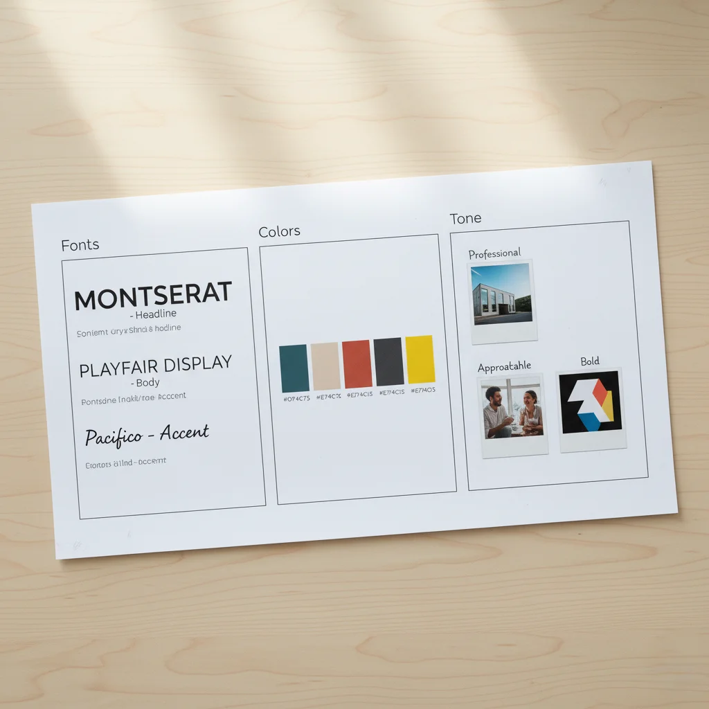
1. Know Your Fonts
Typography is the voice of your brand in visual form. It's one of the most powerful tools for conveying personality, and it's often the most overlooked.
Before you design anything, you should know:
Your primary font — The font you'll use for headlines, titles, and key messages. This font should reflect your brand personality. Is it:
- Modern and geometric (like Montserrat or Futura)?
- Classic and trustworthy (like Playfair Display or Garamond)?
- Friendly and approachable (like Nunito or Poppins)?
- Bold and impactful (like Bebas Neue or Oswald)?
Your secondary font — The font for body text and longer content. This needs to be highly readable. Think Inter, Open Sans, Lato, or Roboto.
Your hierarchy rules — How do these fonts work together? What's your headline size? Subheading size? Body text size? What's the relationship between them?
Why this matters: When you know your fonts before you open your design tool, you're not experimenting with 20 different typefaces for every project. You select your brand font and move on. This saves hours and creates instant consistency.
2. Know Your Colors
Color psychology is real, and your color palette is communicating something whether you intend it to or not.
Before you design anything, you should have:
Your primary color(s) — The 1-2 colors that are distinctly "you." These should align with:
- Your industry expectations (or intentionally break them)
- Your brand personality (energetic = bright colors; sophisticated = deep or muted colors)
- Your audience preferences (B2B corporate = conservative; D2C creative = bold)
Your secondary/accent colors — 2-3 complementary colors that support your primary colors and add flexibility without chaos.
Your neutral palette — Your grays, whites, and blacks. These might seem boring, but they're essential for readability and balance.
Your color rules — When do you use each color? What's your primary color for CTAs? What's your background color for different contexts?
Why this matters: Color decisions are deeply emotional. If you're choosing colors on the fly every time you design, you're relying on your mood that day, not your brand strategy. When you have a defined palette, every piece feels connected.
3. Know Your Tone
This is the one most people skip, and it's a massive mistake.
Your tone isn't just about words — it affects every visual decision you make. A playful brand uses different imagery, different color saturation, different design density than a serious, professional brand.
Before you design anything, you should know:
Your brand personality — Are you:
- Professional and authoritative?
- Friendly and accessible?
- Bold and disruptive?
- Elegant and refined?
- Quirky and creative?
Your emotional goal — How should people feel when they see your brand?
- Inspired and motivated?
- Safe and secure?
- Excited and energized?
- Calm and confident?
Your visual tone — Based on the above, this translates to:
- Photo style (candid or polished? Bright or moody?)
- Design density (clean and minimal or rich and detailed?)
- Visual energy (static and stable or dynamic and bold?)
Why this matters: Tone is the invisible thread that ties everything together. When someone looks at your Instagram, website, and pitch deck, they should feel the same — even if the content is completely different.
The Strategy-First Workflow
Now let's walk through what the actual workflow looks like when you put strategy before design.
Old Way (Design-First Approach):
- Get assignment: "Create an Instagram post about our new feature"
- Open Canva
- Scroll through templates
- Pick one that looks nice
- Change colors to "whatever looks good"
- Try different fonts until something feels right
- Spend 90 minutes creating one post
- Repeat this entire process for the next post because you didn't document anything
Result: Every piece looks different. No consistency. Wasted time. Brand confusion.
New Way (Strategy-First Approach):
- Before you ever design: Define your fonts, colors, and tone (one-time setup)
- Create templates based on these decisions (one-time setup)
- Get assignment: "Create an Instagram post about our new feature"
- Open your branded template
- Drop in content
- Make minor adjustments if needed
- Done in 15 minutes
- Next post? Same process, same speed, always consistent
Result: Every piece feels connected. Instant consistency. Massive time savings. Strong brand recognition.
See the difference? Strategy isn't extra work — it's the shortcut.
How to Define Your Brand Strategy (The Practical Guide)
Okay, so you're convinced. Now what? Here's your step-by-step process:
Step 1: Define Your Brand Personality (30 minutes)
Write down:
- 5 adjectives that describe your brand
- 5 adjectives that definitely DON'T describe your brand
- 3 brands you admire and why
- Your target audience and what matters to them
This isn't design work — it's thinking work. But it's the foundation of every visual decision you'll make.
Step 2: Choose Your Fonts (1 hour)
Based on your personality, go to Google Fonts or Adobe Fonts and:
- Select one display/headline font that matches your personality
- Select one body text font that's highly readable
- Test them together — do they complement each other?
- Document the exact names and when to use each
Pro tip: Limit yourself to 2-3 fonts maximum. More than that and you create chaos, not flexibility.
Step 3: Build Your Color Palette (1 hour)
Based on your personality and industry:
- Choose 1-2 primary colors (these are your signature)
- Choose 2-3 accent colors that complement your primary
- Define your neutral palette (grays, off-whites)
- Use tools like Coolors, Adobe Color, or Khroma to refine
Document exact hex codes for every color. This specificity matters.
Step 4: Define Your Tone in Visuals (30 minutes)
Create a simple guide:
- Photo style: 3-5 reference images that capture your vibe
- Design density: minimal, moderate, or rich?
- Visual energy: calm or dynamic?
- Key yes/no rules (e.g., "Yes to candid photos, no to stock photos" or "Yes to white space, no to cluttered layouts")
Step 5: Document Everything (1 hour)
Create a simple one-page brand reference (can be in Notion, Google Docs, or a simple PDF):
- Your fonts and when to use them
- Your color palette with hex codes
- Your tone guidelines
- Visual examples of what's "on brand" vs. "off brand"
Total time investment: About 4 hours. That's it.
Time saved forever: Countless hours of indecision, revision, and inconsistency.
When Strategy Meets Tools
Here's where it gets exciting. Once you have your strategy defined, design tools become incredibly powerful — because now you're using them intentionally, not reactively.
In Canva:
- Set up your brand kit with your fonts and colors
- Create branded templates for common needs
- Every new project starts from your template, not a blank canvas
In Figma:
- Create a design system with your components
- Define styles for colors and typography
- Build reusable components
In PowerPoint/Keynote:
- Create a master slide with your fonts and colors
- Build slide templates for common layouts
- Every new presentation is automatically on-brand
The tool doesn't matter. What matters is that you're entering the tool with clarity, not hoping the tool will give you answers.
The Confidence That Comes From Strategy
There's something psychological that happens when you have brand strategy locked in before you design: you become confident.
You stop second-guessing every choice. You stop asking, "Does this look good?" and start asking, "Is this on-brand?" — which is a much easier question to answer.
You stop seeking validation for every design decision because you're not making decisions based on personal preference — you're following a strategy that's rooted in who your brand is.
This confidence shows up in your visuals. Consistent brands don't just look more professional — they feel more confident. And confidence is magnetic.
The Common Mistakes to Avoid
As you build your brand strategy, watch out for these traps:
Mistake 1: Copying trends instead of defining yourself Trends are tempting, but they're not strategy. Your brand should reflect who you are, not what's popular this month.
Mistake 2: Choosing visuals you personally like vs. what serves your brand Your personal taste doesn't matter. What matters is whether your choices align with your brand personality and resonate with your audience.
Mistake 3: Making strategy too complicated You don't need a 50-page brand book on day one. You need fonts, colors, tone. Start there.
Mistake 4: Treating strategy as "set it and forget it" Your strategy should be stable, but not rigid. Revisit it every 6-12 months as your brand evolves.
The Bottom Line
Every startup founder wants to move fast. And the irony is, skipping brand strategy in the name of speed actually slows you down.
Every time you open a design tool without knowing your fonts, colors, and tone, you waste time making decisions that should have already been made. You create inconsistency that dilutes your brand. You burn hours that could have been spent building your product or talking to customers.
Before you open Canva — or Figma, or any design tool — know who you are.
Define your fonts. Lock in your colors. Clarify your tone. Document it simply. Then, and only then, start creating.
Because here's what happens when you do: design stops being a struggle and becomes a system. Every piece you create looks and feels connected. Your brand becomes recognizable. And you save hundreds of hours over the lifetime of your company.
That's not just good branding. That's smart business.
Ready to build your brand the right way? Close the design tool. Open a document. Define your fonts, colors, and tone first. Then design with confidence — because you'll know exactly who you are before you create anything.