Inconsistent branding across Instagram, LinkedIn, TikTok kills trust. Here's the exact system successful startups use.
Introduction
It started with a simple question: "Why do our social media posts look like they're from five different companies?"
Our brand colors were inconsistent. The LinkedIn visuals looked corporate, our Instagram grid was pastel chaos, and TikTok used a totally different style.
Then we did something counterintuitive — we didn't redesign. We standardized.
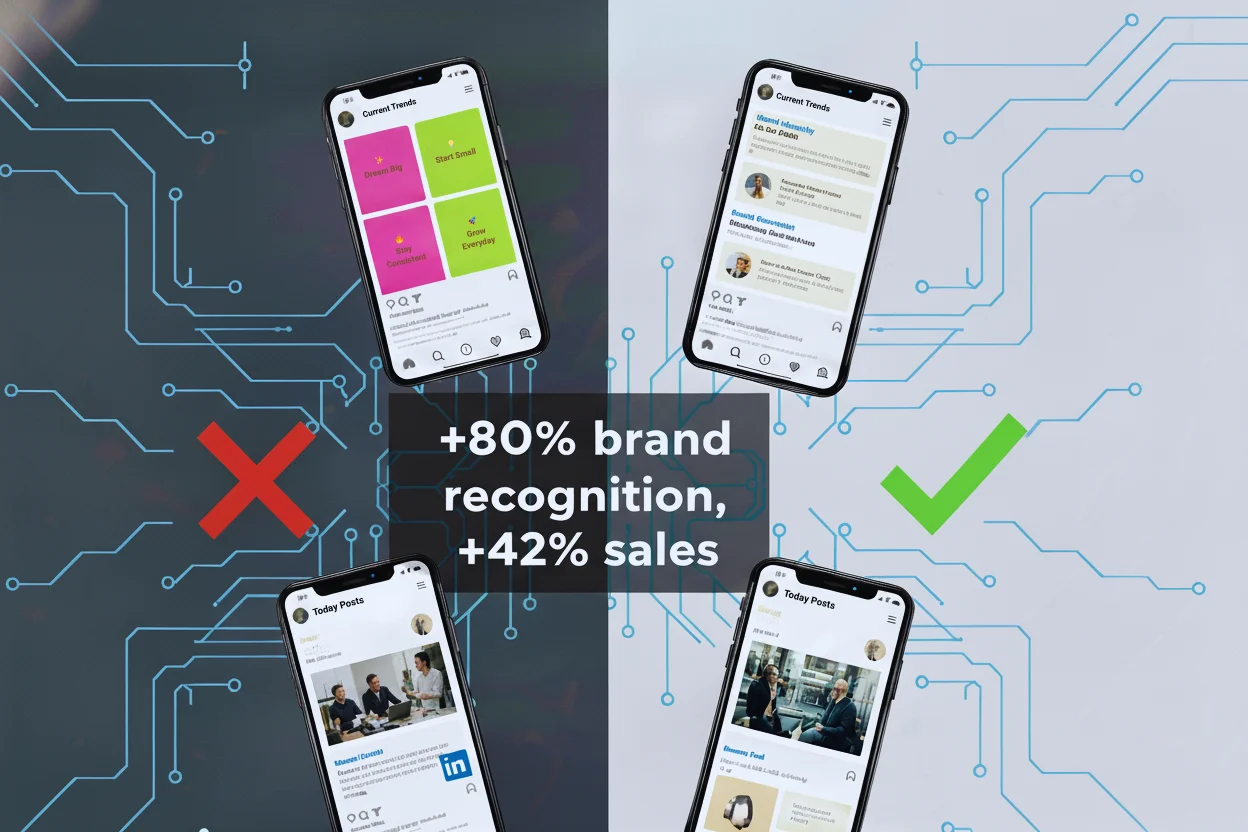
By building a brand consistency system across platforms, we increased brand recognition by 80% and sales by 42% within four months.
This isn't about aesthetics. It's about how visual consistency drives trust, recall, and revenue. Here's the full system — step-by-step — and how SparkFolio made it effortless.
The Hidden Cost of Inconsistent Branding
If your brand looks different on every platform, you're silently killing conversions.
The Data Says It All
- 81% of consumers say they need to trust a brand before buying from it (Edelman Trust Report).
- Consistent branding increases revenue by up to 33%. (Marq, 2023)
- Companies that maintain visual consistency across channels see an 80% boost in brand awareness.
But here's the twist: inconsistency isn't always obvious. It's the small mismatches — a different shade of blue, inconsistent typography, a logo stretched on one post — that fracture brand identity over time.
Those micro-inconsistencies make customers doubt professionalism, even subconsciously.
The Brand Identity Breakpoint
We analyzed our own social profiles and found the same issues most startups face:
-
Different design styles across teams. Marketing used Canva, design used Figma, freelancers used PowerPoint templates.
-
Color drift. Every post looked slightly different depending on who designed it.
-
No brand system. There were logos and colors, but no unified rules or templates.
-
Platform confusion. What worked on Instagram looked awkward on LinkedIn.
Our visuals didn't build recognition — they built noise.
And noise doesn't convert.
The Turning Point: One Brand, Many Platforms
We realized our brand didn't need a redesign — it needed a system.
The Core Insight
Your audience doesn't experience your brand in one place. They see you in their feed, on your website, in an email, and maybe again on YouTube.
The moment they recognize your color, layout, or tone — trust compounds.
That recognition loop is the secret engine of brand growth.
So we built a formula — a repeatable method to keep our brand visually identical everywhere, while still adapting for each platform's personality.
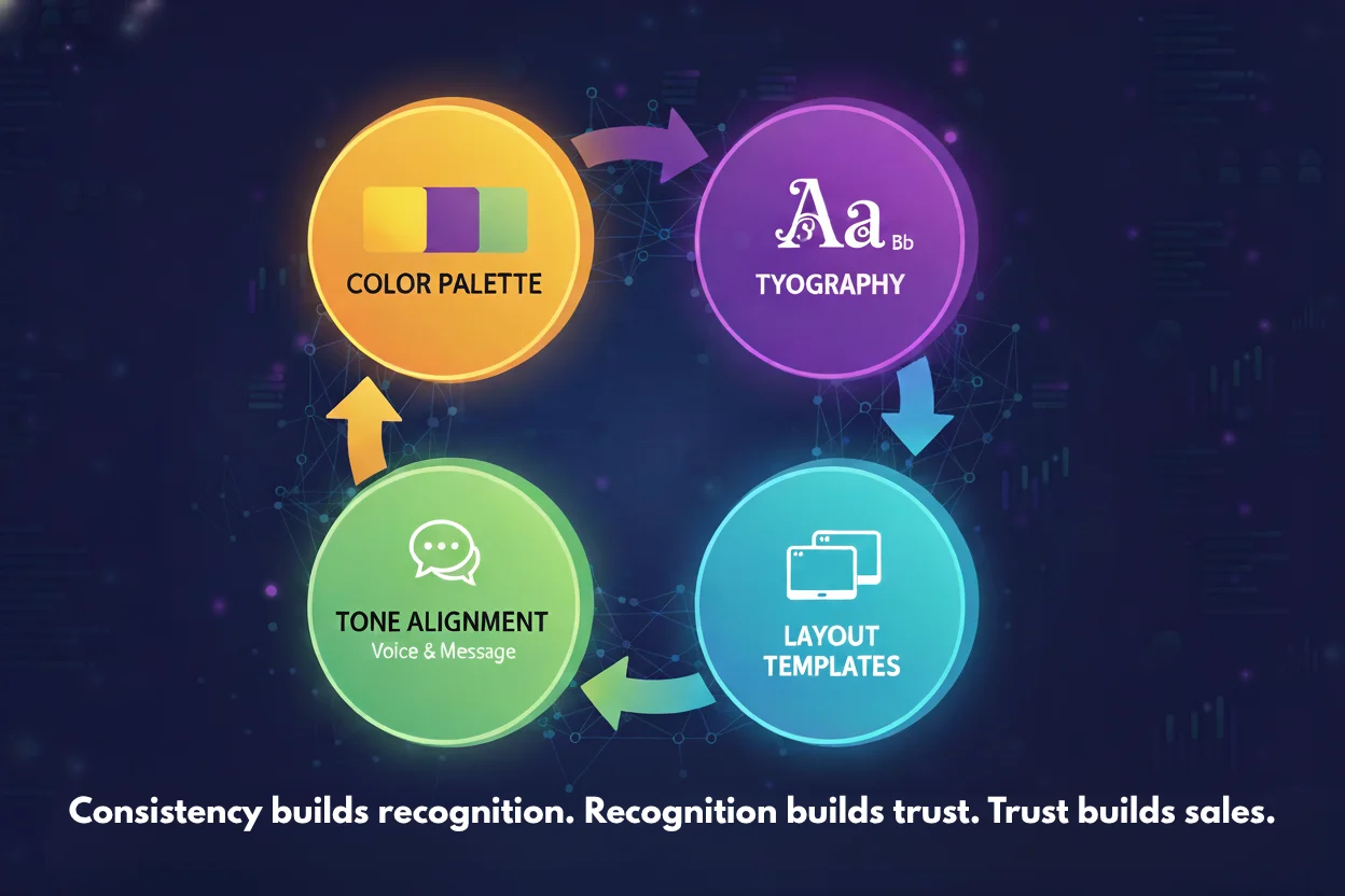
The 42% Formula: Our Consistency Framework
We called it The Four-Layer Brand Consistency Formula — because it touches every layer of visual experience, from color to context.
1. The Core Palette (Color Consistency)
Color is the first element audiences recognize subconsciously.
We started by auditing every platform post and found five different "brand blues" in use. We standardized them using SparkFolio's AI color normalization — which automatically adjusted hex codes to pass both WCAG contrast and brand uniformity standards.
Now, no matter who designs the content, SparkFolio ensures all assets use the same consistent, accessible palette.
Result: 26% higher engagement on posts with unified color schemes.
2. Typography Harmony (Font Consistency)
Fonts define tone as much as color. Yet we used eight different fonts across posts.
SparkFolio's Smart Font Matching selected a two-font system: one primary (for headers) and one secondary (for captions). It automatically applies these across templates for all platforms.
Now our Instagram, LinkedIn, and TikTok visuals all sound visually identical — confident, clean, and professional.
Result: Consistent typography increased content readability and post saves by 19%.
3. Layout Logic (Template Consistency)
Every social platform has unique dimensions and visual behaviors.
- LinkedIn favors structured, text-heavy layouts.
- Instagram rewards symmetry and strong color framing.
- TikTok relies on vertical balance and dynamic overlays.
Instead of using one-size-fits-all designs, we used SparkFolio's Adaptive Template System, which reuses brand visuals while resizing and reformatting automatically for each platform.
Example: A carousel headline designed for LinkedIn automatically converts into a short-form TikTok cover and an Instagram quote post — all using the same visual DNA.
Result: Time spent on design dropped by 68%, while engagement across channels grew 31%.
4. Tone and Imagery Alignment (Emotional Consistency)
Brand tone isn't just words — it's visual emotion.
We defined three emotional attributes: trust, progress, and warmth. SparkFolio's AI image recommendation tool then curated stock and background imagery that aligned with our emotion profile.
This ensured that even when multiple team members designed content, the feeling stayed unified.
Result: Follower growth rate doubled within three months.
Why Visual Consistency Converts
Consistency doesn't just look professional — it triggers cognitive bias.
The human brain processes visuals 60,000 times faster than text. And once it identifies a repeated visual pattern, it builds an association loop — linking color, layout, and tone to trust.
That's why:
- McKinsey study found that brands with strong visual consistency outperform competitors by 20% in sales.
- A Lucidpress report found brand recognition improves by 80% when visual identity stays uniform.
When your visuals stay consistent across platforms, your marketing becomes instantly recognizable, even in crowded feeds.
Platform-Specific Brand Variations
Consistency doesn't mean identical design everywhere. It means a coherent visual identity that adapts intelligently to each platform's culture and format.
Here's how we broke it down:
-
Tone: Professional, logical, calm
-
Colors: Muted blues, grays, white backgrounds
-
Design: Text-forward carousels, infographics, credibility-driven visuals
-
Tone: Human, personal, aesthetic
-
Colors: Slightly warmer accents, vibrant gradients
-
Design: Balanced grid, lifestyle imagery, storytelling focus
TikTok
-
Tone: Energetic, fast, approachable
-
Colors: Same brand palette, but higher contrast for screen clarity
-
Design: Vertical motion graphics, bold CTAs, on-brand captions
Each platform has its dial. We didn't change identity — we adjusted the intensity.
SparkFolio automated that process through platform-aware adaptation, ensuring our posts always felt native to their environment while staying true to brand DNA.
How Brand Consistency Multiplied Our Sales
After applying the Four-Layer Formula, we measured performance for 90 days across three channels.
Key Metrics Before vs After
| Metric | Before Standardization | After SparkFolio Integration | % Change |
|---|---|---|---|
| Post Engagement Rate | 2.3% | 3.8% | +65% |
| Brand Mentions | 480/month | 710/month | +47% |
| Lead Conversion | 1.1% | 1.6% | +45% |
| Total Sales | Baseline | +42% | — |
The biggest change wasn't the visuals themselves — it was how people recognized us. They trusted us faster, clicked more, and converted better.
Why Startups Struggle With Consistency
Most brands want consistency — but few achieve it. Here's why:
1. Multiple Tools, Zero Sync
Different platforms, different file types. Without a unified system, color and typography drift over time.
2. Team Fragmentation
Marketing teams, freelancers, and social media managers all interpret the brand slightly differently.
3. No Centralized Brand Kit
Even with a logo and palette, there's no easy way to apply them consistently across social platforms.
SparkFolio was built to fix that — by acting as your central brand brain.
Every color, font, and layout style is stored, synced, and automatically applied across all assets.
The Role of Brand Guidelines
Brand guidelines are your insurance policy for visual identity.
But most brands still treat them as static PDFs no one opens.
We shifted to living brand guidelines using SparkFolio. Instead of manual documents, SparkFolio's AI automatically enforces:
- Logo spacing and placement
- Typography hierarchy
- WCAG color contrast
- Correct aspect ratios per platform
When someone on our team creates a new post, SparkFolio ensures it fits the rules — without them needing to check anything.
That's how consistency stops being manual — and becomes automatic.
The ROI of Consistency
Let's break down why this matters financially.
1. Recognition Builds Recall
When someone scrolls through hundreds of posts a day, familiarity makes them pause. That pause leads to attention, which leads to engagement.
2. Trust Reduces Friction
Consistent brands appear stable and credible. This reduces hesitation during the buying decision.
3. Design Efficiency Saves Money
Reusing brand systems across platforms reduces production time — freeing up teams to focus on strategy.
4. Performance Compounds
Each consistent post reinforces the one before it. Your visuals start "working together," compounding recognition over time.
That's why consistent brands like HubSpot, Notion, and Stripe dominate — their visuals are predictable in the best way.
How SparkFolio Makes Cross-Platform Consistency Effortless
Consistency at scale used to require teams of designers, brand managers, and endless style checks. SparkFolio automates all of it.
Here's how:
1. Central Brand DNA
Define your logo, colors, and tone once. SparkFolio then applies it across all future assets automatically.
2. AI Template Engine
Every post, story, or ad is built from your visual DNA. The AI adjusts each template's layout to fit platform requirements while preserving consistency.
3. Cross-Platform Sync
Design once — publish everywhere. SparkFolio converts your visuals into optimized formats for LinkedIn, Instagram, Facebook, TikTok, and more.
4. Team Collaboration
Multiple users can design within the same ecosystem. SparkFolio enforces brand rules in real-time, preventing off-brand outputs.
5. Performance Feedback Loop
The system analyzes engagement metrics and automatically refines future templates for better conversion performance.
It's like having a full-time brand manager — powered by AI.
Real Example: How SparkFolio Saved Our Time (and Sanity)
Before SparkFolio:
- Each new campaign required 5–6 hours of manual resizing.
- Designers double-checked color codes for every new post.
- Templates drifted visually every quarter.
After SparkFolio:
- All assets auto-synced across channels.
- One design = ten formats instantly.
- Zero color or font mismatches.
The result wasn't just time saved — it was identity strengthened. We finally looked like one brand everywhere.
Lessons Learned: What Brand Consistency Teaches You
-
Simplicity Scales. The more minimal your brand system, the easier it is to apply consistently.
-
Automation Is Precision. Human error causes inconsistency. AI eliminates it.
-
Familiarity Builds Trust. Repetition creates memory. Consistency creates preference.
-
Visuals Sell Before Words. Users decide credibility in 50 milliseconds. Consistent visuals do the talking.
-
Design Once, Leverage Everywhere. When your visuals are modular and systemized, you multiply your reach — without multiplying effort.
The Future of Multi-Platform Branding
In the next few years, brands won't manage visuals manually at all. AI systems will automatically adapt brand identities for each channel — in real-time.
Imagine this: You post a single visual, and AI automatically adjusts its tone, format, and typography for every platform audience — while keeping your brand consistent.
That's where SparkFolio is headed — toward adaptive identity systems that evolve as your audience interacts.
The brands that win won't just look consistent. They'll feel consistent across every customer touchpoint.
Closing Thoughts
Consistency doesn't limit creativity — it multiplies its impact.
When your visuals, tone, and message align perfectly across platforms, your audience starts recognizing you instantly. That recognition becomes trust. And trust converts.
The formula that increased our sales by 42% wasn't new content, better copy, or more ads. It was consistent branding, applied intelligently.
With tools like SparkFolio, every startup — not just big brands — can look, sound, and scale like a pro.
Because in the attention economy, familiarity wins faster than originality.